A Finer World
Thursday, June 18, 2009
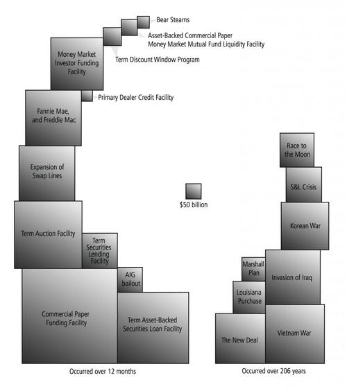
Bailout Nation Chart
A powerful graphic from
Bailout Nation
, recently featured on
Boing Boing
.
Note the size of the New Deal, on the bottom, to the right of center.
The historical numbers are inflation-adjusted.
No comments:
Post a Comment
Newer Post
Older Post
Home
Subscribe to:
Post Comments (Atom)
No comments:
Post a Comment